
Nearly 5x more engaged users
From the first experiment to the 2025 launch, Recap scaled to reach far more users while becoming a bigger product moment.
Overview
Created Miro Recap from scratch, turning year-end reflection into a shareable product ritual delivered to more than 10 million users.
My role
Design strategy, UI, UX, User Research.
Team
Timeline
1.5 Months
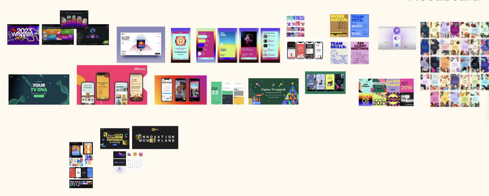
The shareable Miro Recap experience
Impact Overview
Nearly 5x more engaged users
From the first experiment to the 2025 launch, Recap scaled to reach far more users while becoming a bigger product moment.
Around 80% completion
Even as the experience became more ambitious, completion stayed strong because users wanted to follow the story all the way through.
100k+ cursor charms kept
By giving users something to keep after Recap ended, more than 100k users brought their charm back into everyday Miro work.
Every December, Miro slows down. Teams wrap projects, take time off, and spend less time collaborating on boards. For a product built around active teamwork, it is one of the quietest moments of the year.
Most companies would respond with a standard reactivation campaign. I wanted to treat the moment differently.
What if the end of the year could become something people looked forward to instead: a reflective, emotional, and shareable product experience that gave users a reason to come back to Miro and celebrate what they built together?
That question became the starting point for Miro Recap.
In 2024, I led the design of the first-ever Miro Recap.
We had just three weeks, including development, to take it from concept to launch. I was the only designer on the project, leading the story, the data framing, the end-to-end UX, and the visual design while working closely with engineering to get the experience shipped.
I built the concept around gratitude. Instead of focusing only on personal stats, the experience celebrated the people you worked with and the shared progress you made together. That framing led to the Thank You Card: a simple, emotional ending that gave users something genuinely worth sending to a teammate.
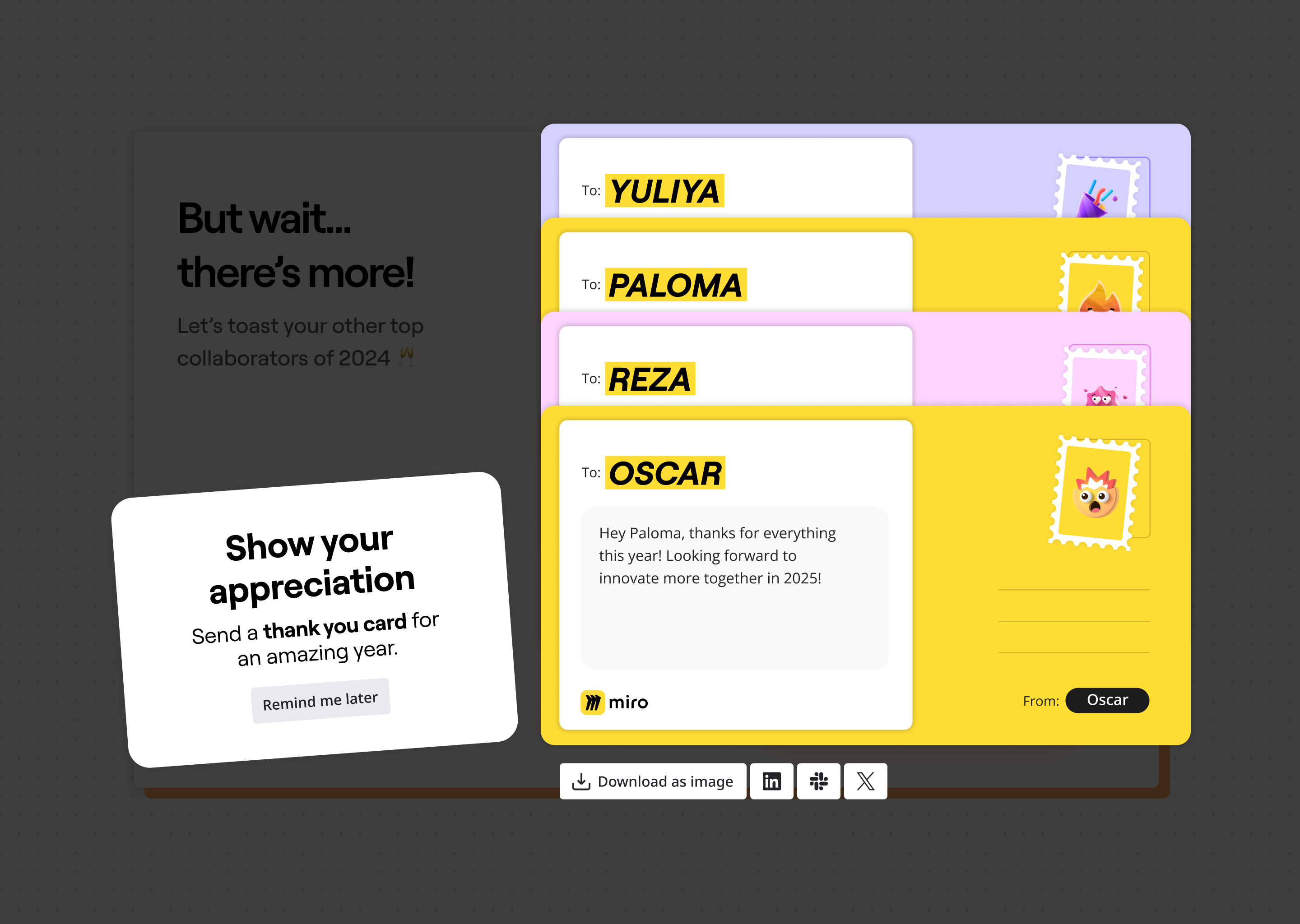
I designed the full experience arc, from presenting each user's year in Miro to building toward that final, shareable moment of gratitude.
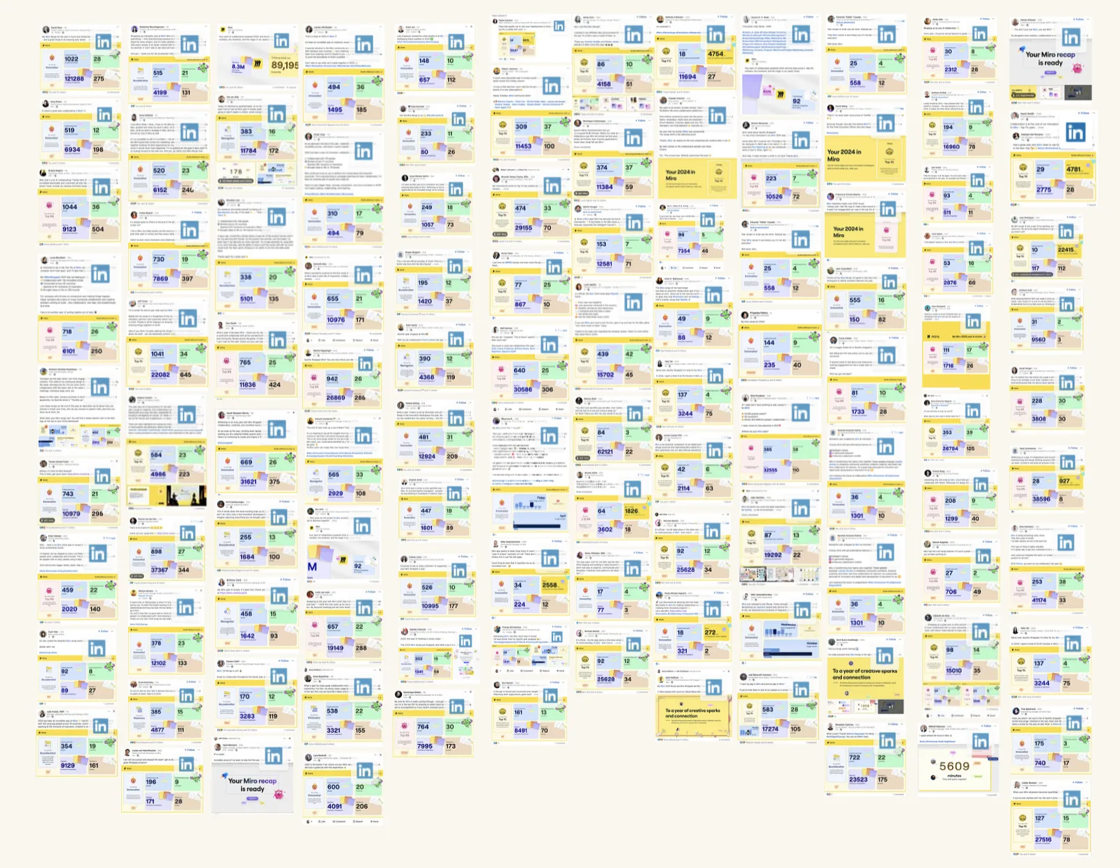
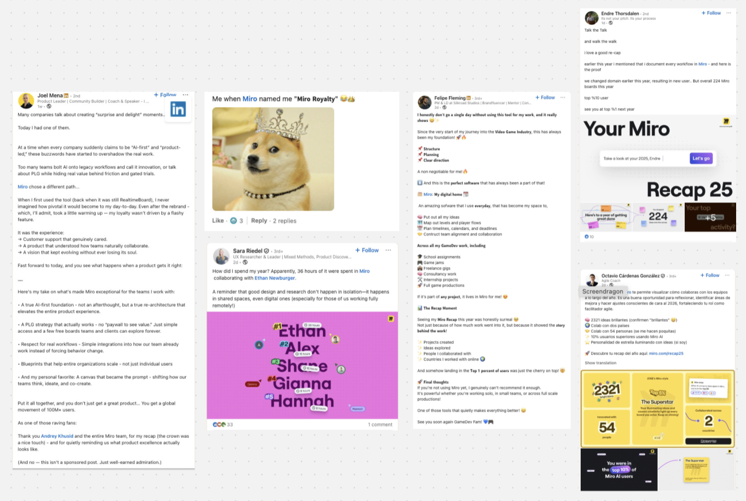
This is the kind of organic response that showed us Recap could travel beyond the product and become something people genuinely wanted to post.
The first version of Miro Recap was sent to more than 10 million users.
Within a short time, people started sharing their results on social media. Hundreds of posts appeared organically. People were not just sharing the recap, they were bragging about their year in Miro.
That behavior told us something important. The experience had the potential to travel beyond the product itself.
The recap also reached an 83% story completion rate, which gave us strong confidence that users enjoyed the experience and were willing to follow it all the way through.
Together, those signals showed that this was more than a one-off campaign. It could become a recurring product ritual inside Miro.
In 2024 it was just me moving fast with full creative control. In 2025, the project grew — marketing, engineering, copywriting, leadership all had opinions and timelines. Getting everyone pointed in the same direction before a single pixel was designed was, honestly, the hardest part of the whole project.
So the first thing I did wasn't open Figma. I ran an alignment workshop.
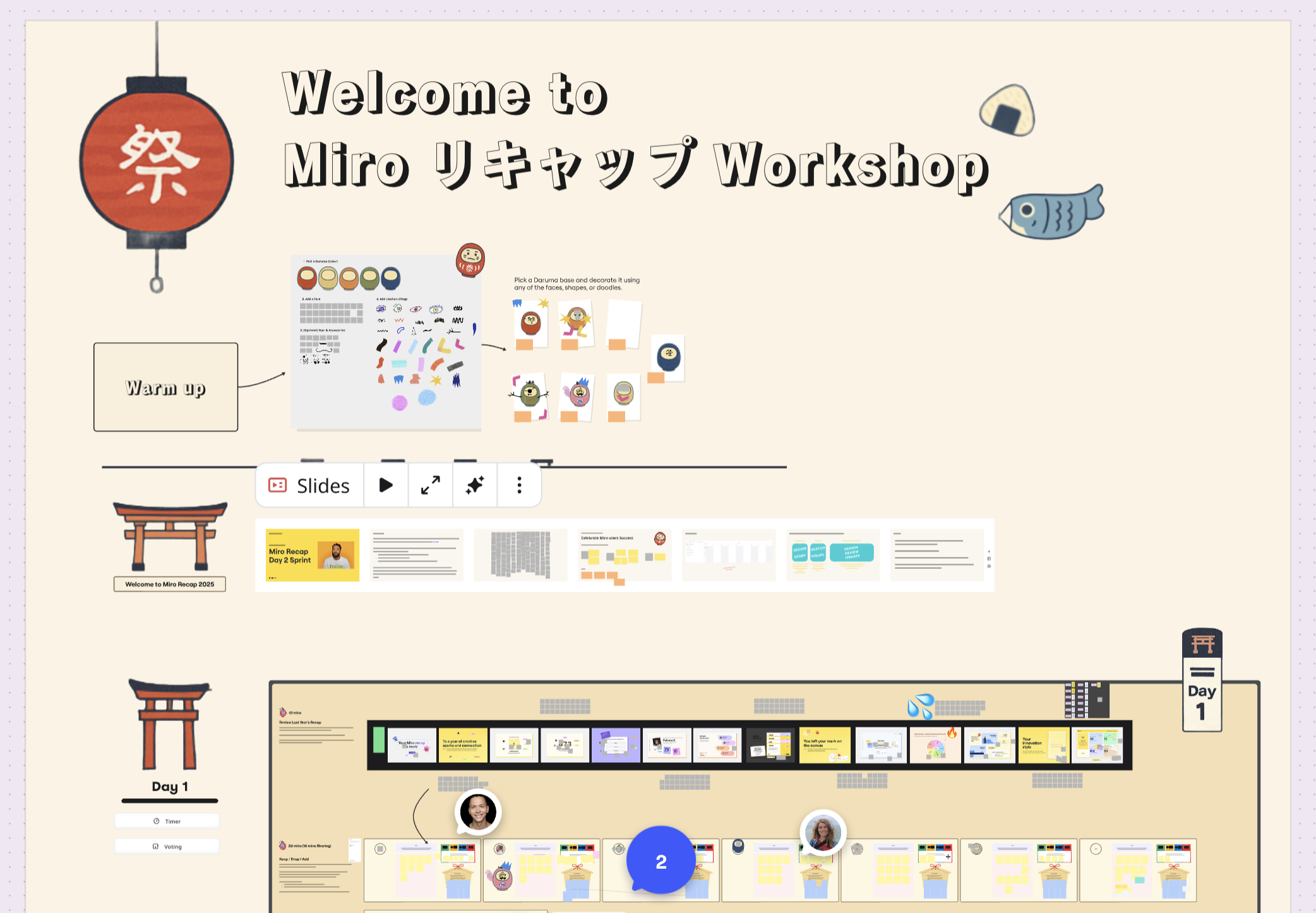
We mapped the full story arc together, identified what made the 2024 experience land, and clarified how the 2025 version should feel more ambitious without losing its emotional core. On a project this cross-functional, alignment was part of the design work.
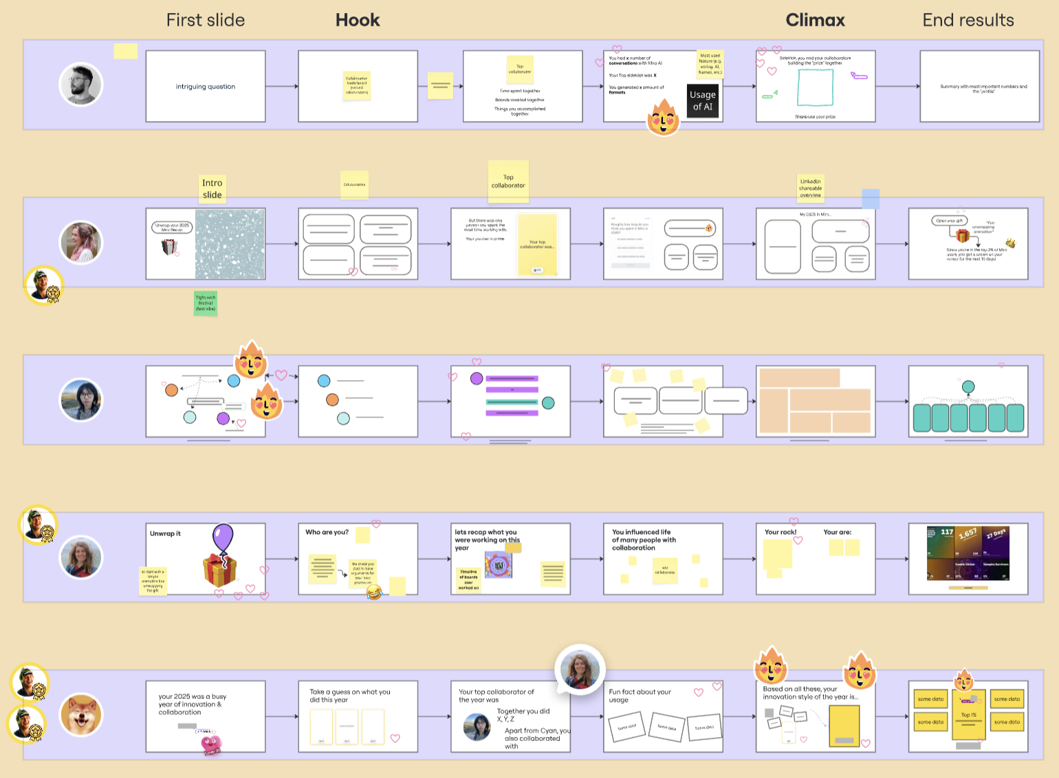
Once the direction was clear, I worked with a supporting designer on visual exploration while holding the overall experience and narrative arc. I also partnered closely with our copywriter, because on a project like this, pacing is defined as much by language as by UI.
Once the team was aligned, the work became about making Recap feel more memorable, more shareable, and more worth coming back to than the first version.
Three parts of the experience made the biggest difference: giving users something to keep, making sharing feel personal, and pushing the final craft until the whole story felt delightful in motion.
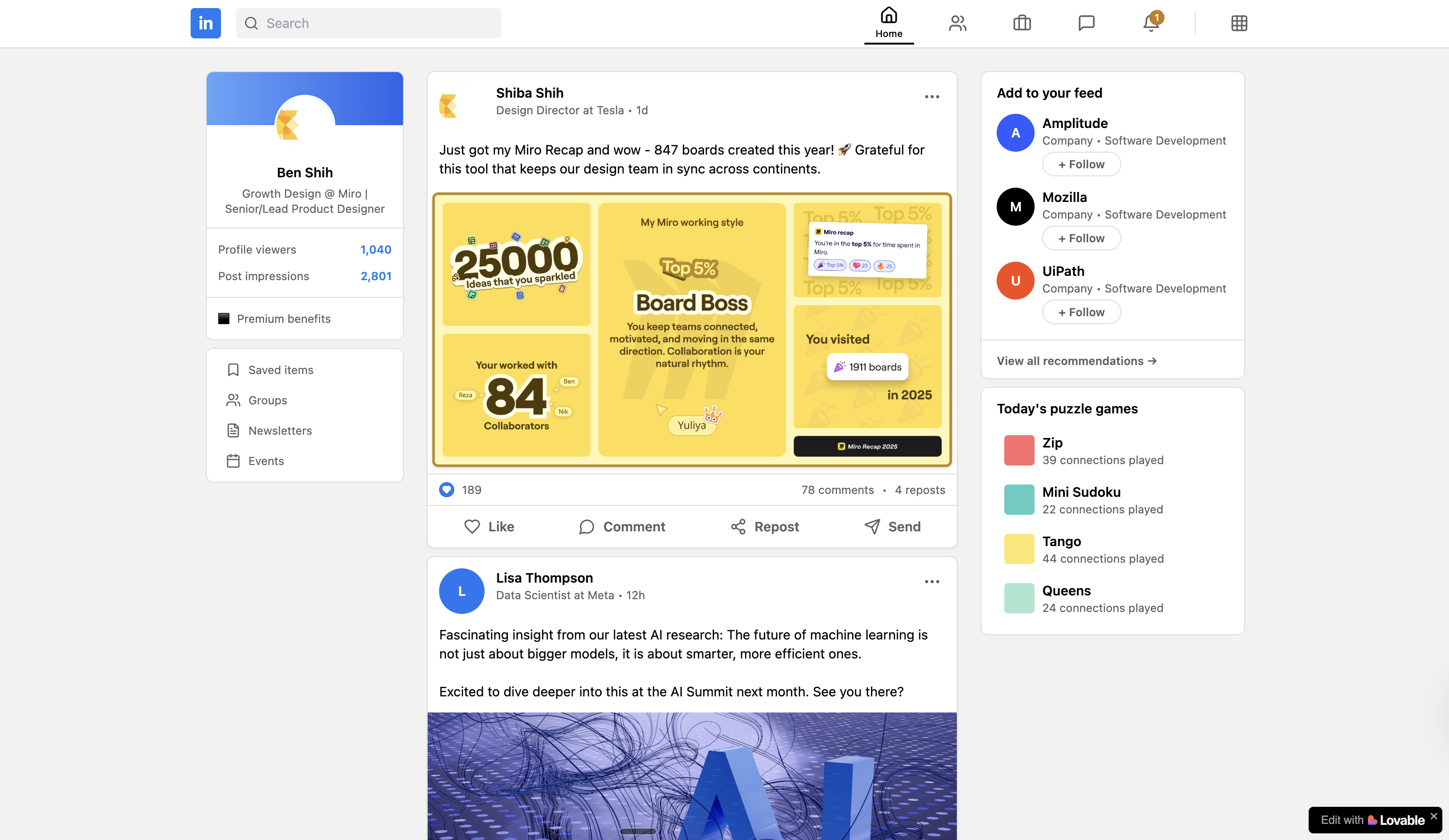
After the first launch, one idea stayed with me: Miro is where people spend hours collaborating, but it rarely leaves them with something personal to keep.
If Recap was going to become a ritual, it needed to leave behind something more lasting than a share card. The answer was hiding in plain sight: the cursor, the way users show up in Miro. That led to cursor charms, a small reward users could carry into future collaboration.
The charm changed how we thought about success. It was no longer just about completion, but about whether people wanted to keep part of Recap with them afterward.
The shareable card is the moment Recap leaves the product and enters the world. For many people, it might be their first time seeing Miro Recap, or even Miro itself.
The design tension was clear: the card needed to stand out enough to stop a scroll, but still feel personal enough that people would want to share it. Too polished and it feels like marketing. Too plain and it disappears.
The detail that unlocked it was simple. Right before sharing, users could choose the color of their card. That small moment of customization made the card feel like theirs, and once it felt personal, people were much more likely to share it.
A big part of my work on Recap was not just designing screens, but using AI to help me code and refine the final experience directly in the product.
Recap only works if it feels good in motion. Static mockups can look finished, but the real experience lives or dies on timing, easing, and choreography. Working directly in code with AI helped me iterate faster, test ideas in the real product, and push the final level of delight much further.
Text animation shaped the reading rhythm of the experience. I used AI to help explore and implement different timing variations until each transition felt intentional.
Swimming cursors helped make the experience feel collaborative even while users were going through Recap alone. The motion was designed to suggest that your teammates were still there with you throughout the story. AI made it easier to quickly test and refine those interaction details in code.
The 2025 release expanded Recap from a successful experiment into a much broader product moment: a stronger narrative arc, a more refined sharing experience, and a lasting reward users could bring back into Miro after the story ended.
We saw nearly 5x more engaged users, a similar completion rate of around 80%, and more than 100k users keeping their cursor charms.
The 2025 version reached far more users than the first launch while staying strong on completion. Even as the experience became more ambitious and layered, people were still willing to follow it all the way through.
The number that mattered most to me was cursor charm retention. More than 100k people chose to keep something from Recap and bring it back into their everyday work in Miro. That is a deeper signal than a click, a share, or even a completion. It means the experience left a lasting mark.
Driving adoption of Miro features
Behavior-based activation experiments that moved passive users into active creators.
Redesigning Lokalise onboarding
How we improved activation and trial-to-customer conversion through a full onboarding redesign.
AI Translation Review
Bringing AI into the translation review workflow to help teams move faster without losing quality.
